
Getting Started with Figma Components
Learn how to create reusable components that speed up your design process and maintain consistency across projects.
Read MoreCreate scalable, maintainable design systems that keep your entire team aligned on components, tokens, and design standards
Design systems aren’t just for massive companies. They’re genuinely useful for any team working on more than one project. When you’re coordinating across designers, developers, and product managers, inconsistency becomes a real problem. Colors shift slightly between pages. Button styles vary. Typography doesn’t match. Then you’re spending time fixing things that should’ve been solved once.
A design system in Figma solves this by creating a single source of truth. Everyone references the same components, the same color palette, the same type scale. You’re not reinventing the wheel on every new screen. Instead, you’re building on what’s already established. That’s where Figma shines — it’s built for this exact workflow.

Design tokens are where everything begins. These are your core design decisions — colors, spacing, typography, shadows, everything. Instead of using random hex codes scattered throughout your files, you define them once as tokens. Then you reference those tokens everywhere.
In Figma, you’ll set up tokens for colors first. Most teams start with 8-12 primary colors plus variations. We’re talking your primary blue, secondary accent, neutrals for text and backgrounds, and status colors like success green and error red. Then define spacing — use increments like 4px, 8px, 16px, 24px, 32px. Keep it systematic.
Pro tip: Use Figma’s Variables feature (released mid-2024) to link tokens directly to components. When you change a token value, every component using it updates automatically across all files.
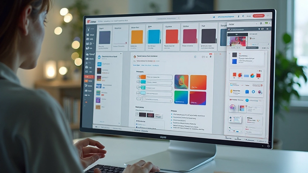
Once tokens are set, you’re ready to build components. Start simple. Button component. Text input. These basic elements become the foundation for everything else. Each component should have clear variants — primary button, secondary button, disabled state, loading state. Show all variations so anyone using the library knows what’s available.
Your library structure matters. We typically organize it like this: foundations (colors, typography), atoms (basic components like buttons), molecules (combined components like search bars), and organisms (complex sections). This naming convention, borrowed from atomic design, keeps things organized as your library grows to 50+ components.
Don’t skip documentation. For each component, add a description in Figma explaining its purpose. When should designers use this versus that? What are the size constraints? Document this directly in your library. Future you and your teammates will appreciate it.

Organization separates a useful library from a chaotic mess. Create a dedicated file just for your design system. Publish it as a Shared Library in Figma. This lets other files reference your components without duplicating them. When you update a component in the library, those updates flow to every project using it.
Set up clear naming conventions from day one. Use forward slashes to create hierarchy: Button/Primary, Button/Secondary, Button/Disabled. Input/Text, Input/Textarea, Input/Error. This hierarchy appears in the components panel when designers insert elements, making everything findable. Don’t overthink it — consistency matters more than perfection.
Plan for maintenance. Assign someone ownership of the design system. They’re responsible for reviewing new component requests, updating documentation, and managing library versions. Without clear ownership, the system decays. Token values drift. Unused components pile up. Documentation gets stale.
As your system grows, these practices keep things manageable
Group related components into sets. A button set contains all button variants. An input set contains text inputs, textareas, selects. This reduces clutter in the components panel and makes it obvious what variations exist for each element.
Use master components as the source of truth. Every instance of a button references the same master. Change the master, and every instance updates. This prevents drift where one project’s buttons look slightly different from another’s.
Plan updates carefully. Major changes (removing components, changing structure) get new library versions. Minor updates (adjusting spacing, refining colors) can roll out immediately. Give teams time to migrate between major versions rather than forcing instant adoption.
Figma is great for the design system itself, but you’ll want a separate documentation website. Tools like Storybook or Zeroheight let you create comprehensive guides with live component examples, usage rules, and accessibility notes that designers and developers both reference.
Use plugins like Design Tokens or Token Studio to export your tokens to JSON. Developers can then import these directly into code. No more translating hex codes manually. The same color values used in design go straight into CSS variables.
Every quarter, review your library. Which components get used constantly? Which are gathering dust? Unused components clutter the library. Consolidate them or remove them. This keeps the system lean and focused on what actually matters.
Start small. Don’t try to document your entire design system on day one. Create your core tokens, build 8-10 essential components, and launch. You’ll iterate based on what your team actually needs. A design system that’s 80% complete and in use beats one that’s 100% complete but never ships.
Explore More Figma Guides


This guide provides educational information about building design systems in Figma based on common industry practices. The specific tools, workflows, and approaches you choose should be tailored to your team’s needs, project requirements, and organizational structure. Design systems are living documents that evolve as your team and products grow. What works for one team may need adjustment for another. Consider your team’s size, project complexity, and available resources when implementing these recommendations. Figma’s features and capabilities continue to evolve, so we recommend checking the official Figma documentation for the most current information on variables, shared libraries, and component features.