Getting Started with Figma Components
Learn how to create reusable components that speed up your design process. We’ll walk through the basics and show you why components save hours of work.

Why Components Matter
Components are one of Figma’s most powerful features. They’re essentially reusable design elements that you create once and use everywhere. Think of them as building blocks for your designs. You create a button component, and suddenly you can use that same button across 50 different screens. When you update the main component, every instance automatically updates too.
This isn’t just about saving time. It’s about maintaining consistency. Every button looks the same. Every form field behaves the same way. Your whole design stays cohesive without the tedious manual work. We’ve seen designers cut their production time in half just by implementing components properly.
Understanding Main Components and Instances
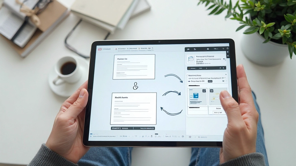
In Figma, there are two key concepts you’ll work with: main components and instances. A main component is the source file — the original design. You create it once with all the details you want. An instance is a copy that’s linked to that main component. When you change the main component, all instances update automatically.
Here’s what makes this powerful. Say you’re designing a card component. You create the main component with a specific border radius, shadow, and padding. Then you place that card 15 times across your designs. Three weeks later, the designer says “make the shadows lighter.” You edit the main component once. Boom. All 15 cards update instantly. No searching through files. No manual updates.
You’ll notice in the Layers panel that instances show a different icon than main components. Main components have a purple diamond icon. Instances show a purple diamond with an arrow. This visual distinction helps you quickly identify what you’re working with.
Creating Your First Component
Design Your Element
Start by designing the element you want to turn into a component. It could be a button, a card, a navigation bar, or anything you’ll use multiple times. Don’t worry about perfection — you can refine it later.
Select and Create
Select your design on the canvas. Go to the right-click menu and choose “Create component” or use the keyboard shortcut (Ctrl+Alt+K on Windows, Cmd+Option+K on Mac). Your element is now a main component.
Create Instances
Drag your component onto your canvas to create instances. You’ll see it appears as a linked copy. Edit any instance properties, but the core structure stays connected to the main component.
Organize in Assets
Your components appear in the Assets panel. You can drag them onto any frame. Keep them organized with clear naming — something like “Button/Primary” or “Card/Feature” helps teammates find exactly what they need.
Working with Component Variants
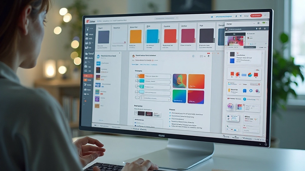
Once you’ve created a component, you’ll want different versions of it. A button component might need a primary style, secondary style, and disabled state. Instead of creating three separate components, you use variants. Variants are different configurations of the same component that share core properties.
To create a variant, select your main component and look for the plus icon next to it in the Design panel. This creates a variant set. You can then add multiple variants — primary, secondary, danger, etc. Each variant can have different colors, sizes, or text, but they’re all managed as one component family.
Your teammates will love this. Instead of hunting through a component library with 50 different buttons, they see one button component with a dropdown menu showing all available variants. They pick what they need. It’s organized, professional, and incredibly efficient.
Best Practices for Component Success
Name Components Clearly
Use a naming convention everyone understands. “Button/Primary/Large” tells you exactly what it is. Avoid generic names like “element1” or “component_v2”. Your future self will thank you.
Create Modular Components
Build components from other components. A card might contain button instances. A form section might contain input instances. This creates a hierarchy that’s easier to maintain and update.
Use Component Properties
Figma lets you set properties on components that control appearance. Instead of managing multiple variants, use properties to let users customize colors, text content, or visibility. It’s powerful stuff.
Keep Components Organized
Store all main components in a dedicated file or page. Organize them in folders by category — buttons, forms, cards, navigation. When your library has 100 components, good organization saves enormous amounts of time.
Document Your Components
Add usage notes. Create a components page that shows each component, its variants, and how to use it. A quick reference guide prevents misuse and speeds up onboarding for new team members.
Version Your Components
When you make significant changes to components, consider creating a new version rather than updating the existing one immediately. This prevents breaking designs that depend on the old version.
Integrating Components Into Your Workflow
Components shine when they’re part of your daily workflow. Start small. Pick one element you use repeatedly — maybe a button or card — and turn it into a component. Use it across 3-4 designs. Feel how it works. Then expand to more components.
As your component library grows, it becomes your design system. New designs go faster because you’re not starting from scratch. Consistency improves because everything uses the same components. Updates are simpler because changes flow through the entire system automatically.
The real magic happens when your whole team uses the same components. A designer in Kuala Lumpur and another in Penang both use identical buttons, spacing, and colors. Client feedback becomes easier to implement because you know exactly where to make changes. It’s design efficiency at scale.
Start Building Your Component Library Today
Components aren’t an advanced feature you need to master eventually. They’re a fundamental tool that’ll improve your work from day one. You’ll save time. Your designs will be more consistent. Updates will be easier. Your teammates will work faster.
Begin with the elements you use most. Create a main component. Make a few instances. Watch how updates flow through automatically. Once you feel comfortable, expand to more complex components and variants. Before long, you’ll wonder how you ever designed without them.
“Components are the difference between updating one design and updating 50 designs at once. It’s the most time-saving feature in Figma.”
— Design Teams Using Component Systems

Important Note
This guide is educational material designed to help you understand Figma components and best practices. Figma features, interface layouts, and capabilities may change over time. Always refer to the official Figma documentation for the most current information. Design workflows vary by project and team — adapt these principles to your specific needs and circumstances.